Create a bold editorial campaign poster where oversized typography reacts to or becomes a physical force inside the composition.
Brand: [BRAND NAME]
Product / Campaign: [PRODUCT OR CAMPAIGN]
Main Word: [SHORT WORD]
Subject / Product: [PERSON / PRODUCT / BOTH]
Physical Effect: [SOUND WAVE / REFRACTION / FOLD / TENSION / OTHER]
Main Color: [COLOR]
Accent Color: [COLOR]
Campaign Details: [SLOGAN / SPECS / DATE]
Aspect Ratio: [9:16]
Use realistic commercial photography, oversized typography, bold high-contrast colors, and contemporary editorial design.
Make the main word extremely large, filling roughly 50-75% of the frame. Let it extend beyond the canvas and interact directly with the subject or product.
The typography should clearly express the chosen physical effect. For example, let it expand like sound waves, bend through glass, fold with a surface, stretch under tension, or react to another believable force.
Keep the effect visually clear and physically consistent. Only the affected parts of the typography should distort; preserve enough of the original letterforms to keep the word recognizable.
Integrate the subject or product into the same space using realistic lighting, reflections, shadows, refraction, perspective, or foreground-background layering.
Use one dominant color system with only a few contrasting colors. Add a small amount of meaningful campaign information such as the brand name, product name, slogan, specifications, labels, or callouts.
The final image should feel like a finished commercial campaign key visual — bold, colorful, concept-driven, and visually complete.
Avoid generic 'subject + big text' layouts, random distortion, meaningless filler text, excessive UI graphics, heavy 3D typography, decorative sparkles, clutter, and effects that do not match the chosen physical force.
Four variants (9:16):
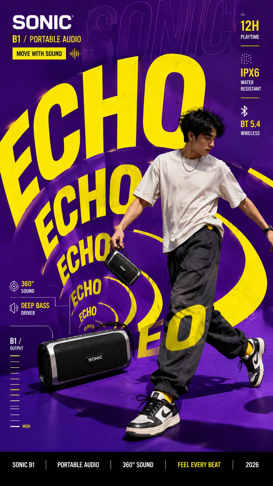
1. ECHO — Main Word: ECHO; Physical Effect: SOUND WAVE — the type expands and ripples outward like sound waves; Subject: a speaker/sound product with a figure; Main Color: warm white; Accent Color: vivid yellow; Campaign Details: ECHO · OVERSIZE TYPE
2. DROP — Main Word: DROP; Physical Effect: REFRACTION — the type bends and distorts behind and through a glass bottle of water; Subject: a water bottle product; Main Color: aqua blue; Accent Color: orange; Campaign Details: DROP · OVERSIZE TYPE
3. PULL — Main Word: PULL; Physical Effect: TENSION — the type stretches and strains like fabric pulled taut; Subject: a sportswear figure pulling a strap; Main Color: coral red; Accent Color: cool white; Campaign Details: PULL · OVERSIZE TYPE
4. FLIP — Main Word: FLIP; Physical Effect: FOLD — the type folds and bends along the creases of a flapping surface; Subject: a folded poster/product in mid-air; Main Color: deep blue; Accent Color: magenta; Campaign Details: FLIP · OVERSIZE TYPE
创作一张大胆的编辑型广告活动海报,其中超大排版字体对构图内部的某种物理力量做出反应,或本身化为这种物理力量。
品牌:[品牌名]
产品 / 活动:[产品或活动]
主词:[短词]
主体 / 产品:[人物 / 产品 / 两者]
物理效果:[声波 / 折射 / 折叠 / 张力 / 其他]
主色:[颜色]
强调色:[颜色]
活动信息:[标语 / 规格 / 日期]
画幅比例:9:16
使用真实的商业摄影、超大排版字体、大胆的高对比色彩与当代编辑设计。
让主词占据约 50–75% 的画面,极其巨大,延伸出画布并与主体或产品直接互动。
排版字体必须清晰地表达所选的物理效果。例如让它像声波一样向外扩散、穿过玻璃发生折射、随表面一起折叠、在张力下拉伸,或对其他可信的力量做出反应。
保持效果在视觉上清晰、物理上一致。只扭曲排版字体受影响的部分;保留足够的原始字形,使单词仍可辨认。
通过真实的光线、反射、阴影、折射、透视或前后景分层,将主体或产品融入同一空间。
使用一个主导色彩系统,仅配少量对比色。加入少量有意义的活动信息,如品牌名、产品名、标语、规格、标签或标注。
最终效果应像一张完成度很高的商业活动主视觉——大胆、色彩鲜明、概念驱动、视觉完整。
避免:通用的"主体 + 大文字"版式、随机扭曲、无意义的填充文字、过多的 UI 图形、浓重的 3D 字体、装饰性闪光、杂乱,以及与所选物理力量不符的特效。
四种变体(9:16):
1. ECHO — 主词:ECHO;物理效果:声波——字体像声波一样向外扩散、起伏;主体:音箱/声音产品配人物;主色:暖白;强调色:亮黄;活动信息:ECHO · OVERSIZE TYPE
2. DROP — 主词:DROP;物理效果:折射——字体在玻璃水瓶后方及透过玻璃发生弯曲变形;主体:水瓶产品;主色:水蓝;强调色:橙;活动信息:DROP · OVERSIZE TYPE
3. PULL — 主词:PULL;物理效果:张力——字体像被拉紧的布料一样拉伸绷紧;主体:运动装人物拉动束带;主色:珊瑚红;强调色:冷白;活动信息:PULL · OVERSIZE TYPE
4. FLIP — 主词:FLIP;物理效果:折叠——字体沿着翻飞表面的折痕折叠弯曲;主体:半空翻动的折叠海报/产品;主色:深蓝;强调色:品红;活动信息:FLIP · OVERSIZE TYPE