[Theme]: Eastern cultural artifact / antiquity theme — four variants
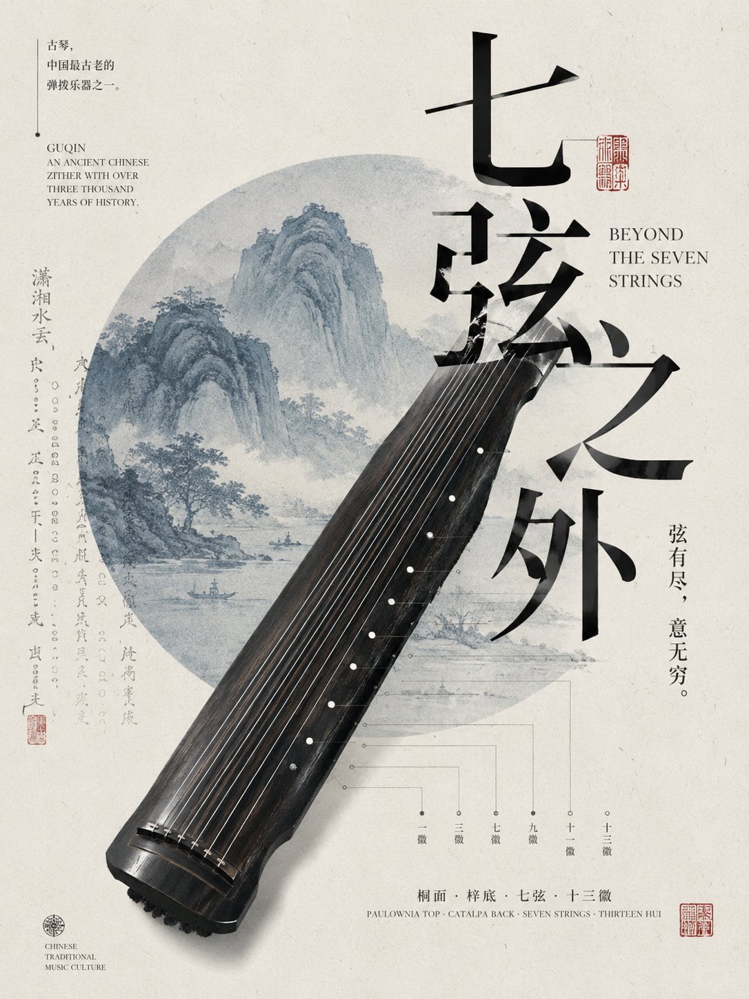
[Core artifact]: variant 1 — guqin (ancient seven-string Chinese zither); variant 2 — lacquerware; variant 3 — bronze mirror; variant 4 — mortise-and-tenon (Chinese traditional wooden joinery)
[Chinese main title]: variant 1 — 「七弦之外」(Beyond the Seven Strings); variant 2 — 「漆色千年」(A Thousand Years of Lacquer); variant 3 — 「镜里千年」(A Thousand Years in the Mirror); variant 4 — 「木作之间」(Between the Woodwork)
[Auxiliary cultural elements]: variant 1 — landscape geometry; variant 2 — edge-cropped patterns; variant 3 — enlarged pattern; variant 4 — structural diagram
[Main palette]: rice-paper white + 1-2 traditional low-saturation colors
[Accent color]: cinnabar red / mineral blue / bronze green
[Aspect]: 3:4
Generate a modern cultural poster on an Eastern antiquity theme, combining traditional objects with contemporary editorial layout. Use the [core artifact] as the absolute main visual, enlarged to a large scale, occupying about 40%-65% of the frame, allowed to enter from the edge, partially exceed the frame, and not necessarily shown in full. Use incomplete cropping, scale contrast and large negative space to build a strong visual focus, avoiding a generic centered-display composition.
Around the main subject, add a small number of [auxiliary cultural elements] directly related to the [theme], which can be enlarged patterns, cropped ancient paintings, landscape geometry, rubbings, structural line drawings or partial details, and reorganized through circles, semicircles, open color blocks, thin lines and negative space, forming a modern and restrained visual hierarchy.
The Chinese main title uses a relatively large Song typeface, modern Chinese font or a font with a small sense of handwriting, making the text itself part of the composition, which can occlude, interweave or be cropped with the artifact. Pair with a small amount of English Serif fonts, small cultural notes, artifact information or structural labels, forming a three-level typography of 'large title — auxiliary info — micro annotation'.
Overall adopt an asymmetric editorial layout, do not place elements evenly. Background stays clean rice-paper white or ivory white, with slight paper fibers, ancient book printing or woodblock grain texture, but do not yellow overall, over-age or look dirty.
Colors are dominated by low-saturation Eastern traditional colors, keeping only one relatively strong accent color as the visual anchor. All on-image text must be real, meaningful, and related to the theme; do not use random English or meaningless placeholder characters.
Overall effect should look like modern museum exhibition visuals, cultural art publications or premium cultural-creative posters: traditional content is clear, but the layout is modern, restrained, and design-led.
【主题】:东方文化 / 古物主题 —— 四种变体
【核心古物】:变体一·古琴;变体二·漆器;变体三·铜镜;变体四·榫卯
【中文主标题】:变体一·「七弦之外」;变体二·「漆色千年」;变体三·「镜里千年」;变体四·「木作之间」
【辅助文化元素】:变体一·山水几何;变体二·边缘裁切纹样;变体三·纹样放大;变体四·结构图谱
【主色调】:宣纸白 + 1–2 种传统低饱和色
【强调色】:朱砂红 / 矿物蓝 / 青铜绿
【画幅比例】:3:4
生成一张东方古物主题的现代文化海报,将传统器物与当代编辑版式结合。把【核心古物】作为绝对主视觉,大尺度放大,占画面约 40%–65%,允许从画面边缘切入、局部超出画幅,不必完整展示。通过不完整裁切、比例反差和大面积留白建立强视觉重心,避免普通的居中陈列式构图。
围绕主体加入少量与【主题】直接相关的【辅助文化元素】,可使用纹样放大、古画裁切、山水几何、拓片、结构线稿或局部细节,并通过圆形、半圆、开放色块、细线和留白重新组织,形成现代而克制的视觉层次。
中文主标题使用较大的宋体、现代中文字体或带少量书写感的字体,使文字本身成为构图的一部分,可与古物产生遮挡、穿插或裁切关系。搭配少量英文 Serif 字体、小型文化说明、器物信息或结构标注,形成"大标题—辅助信息—微型注释"三级排版。
整体采用非对称编辑式布局,不平均摆放元素。背景保持干净的宣纸白或象牙白,带轻微纸张纤维、古籍印刷或版画颗粒质感,但不要整体发黄、做旧过度或显得脏。
色彩以低饱和东方传统色为主,只保留一个较强的强调色作为视觉锚点。所有画面文字必须真实、有意义,并与主题相关,不使用随机英文或无意义占位字符。
整体效果像现代博物馆展览视觉、文化艺术出版物或精品文创海报:传统内容明确,但版式现代、克制、有设计感。