Design a 2:3 vertical Eastern-ware Editorial poster. Four variants.
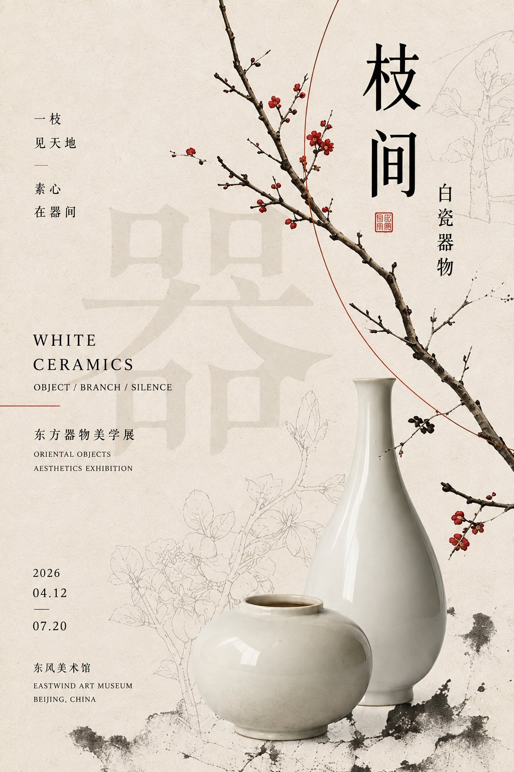
Variant 1 — 枝间白瓷 (White Porcelain Among Branches):
[Theme]: a white porcelain vessel framed by a wandering branch
[Core ware]: a thin-walled white porcelain vase
[Main title]: 枝间白瓷
[Subtitle]: White Porcelain Among Branches
[Main color]: warm celadon gray
[Penetrating linear element]: a slender living branch threading through the frame
[Small accent color]: deep ink black
[Brand / series name]: 器物志
Variant 2 — 青花游线 (Blue-and-White Wandering Line):
[Theme]: blue-and-white porcelain patterns running off the vessel
[Core ware]: a blue-and-white porcelain vase
[Main title]: 青花游线
[Subtitle]: Blue-and-White Wandering Line
[Main color]: cobalt blue + warm ivory white
[Penetrating linear element]: the porcelain pattern itself, extending from the vessel into the page as a wandering line
[Small accent color]: brass gold
[Brand / series name]: 器物志
Variant 3 — 土与形 (Earth and Form):
[Theme]: rough pottery and diagonal cutting
[Core ware]: a coarse unglazed pottery piece
[Main title]: 土与形
[Subtitle]: Earth and Form
[Main color]: warm raw-earth brown
[Penetrating linear element]: a strong diagonal slash that cuts across the frame
[Small accent color]: cinnabar red
[Brand / series name]: 器物志
Variant 4 — 黑釉曲面 (Black Glaze Curve):
[Theme]: black pottery and free red line
[Core ware]: a black-glaze ceramic vessel with a flowing curve
[Main title]: 黑釉曲面
[Subtitle]: Black Glaze Curve
[Main color]: deep black + warm ivory white
[Penetrating linear element]: a free red line that traces the vessel's curve and continues into the page
[Small accent color]: bright vermilion red
[Brand / series name]: 器物志
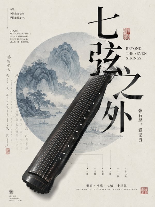
Overall: warm ivory-white paper as base, with slight fibers and printing grain, combining real ware photography, Chinese type, English small text, line drawing and a small amount of Eastern graphics. The frame keeps medium-to-high information density but avoids over-stuffing. Use 2-3 main visual clusters to organize the page, and design a 'visual thread' running through the frame, connecting the title, the ware and the auxiliary graphics, so the elements interweave: text can be partially occluded by the ware, lines go around the main subject, patterns can extend from the ware onto the page, and light-colored large text hides in the background.
Typography builds a clear four-level scale: giant visual text / medium Chinese title / small English / very small info text, with horizontal, vertical and staggered combinations, partial out-of-bounds but the whole controlled by an invisible grid, forming a 'order within chaos' editorial feel.
The ware avoids simple centered display; can use complete main subject + partial cropping + light line drawing and other multi-layer presentations. The background negative space also joins in low-contrast large text, plant line drawings, ware outlines or textures, so the negative space has content but does not steal focus.
Overall uses a low-saturation main color, only adding one small-area high-recognition accent color for labels, thin lines or local graphics. The image should be elegant, restrained, with a modern Eastern cultural design feel.
Avoid: PPT-style zoning, scattered individual elements, large empty spaces with no content, simple 'ware + title' placement, template-feel logos, numbers, four-corner starbursts, over-the-top guochao decoration.
设计一张 2:3 竖版东方器物 Editorial 海报。共四种变体。
变体一·枝间白瓷:
【主题】:一具白瓷瓶被一根枝条贯穿画面
【核心器物】:薄胎白瓷瓶
【主标题】:枝间白瓷
【副标题】:White Porcelain Among Branches
【主色】:温润青灰
【贯穿线性元素】:一根细长活枝条贯穿画面
【小面积点缀色】:深墨黑
【品牌 / 系列名】:器物志
变体二·青花游线:
【主题】:青花纹样从器壁游走至画面
【核心器物】:青花瓷瓶
【主标题】:青花游线
【副标题】:Blue-and-White Wandering Line
【主色】:钴蓝 + 暖象牙白
【贯穿线性元素】:青花纹样本身,从器物延伸至版面成为游线
【小面积点缀色】:铜金
【品牌 / 系列名】:器物志
变体三·土与形:
【主题】:粗陶与斜线切割
【核心器物】:粗陶未上釉器物
【主标题】:土与形
【副标题】:Earth and Form
【主色】:暖陶土棕
【贯穿线性元素】:一道强劲的斜线横切画面
【小面积点缀色】:朱砂红
【品牌 / 系列名】:器物志
变体四·黑釉曲面:
【主题】:黑陶与自由红线
【核心器物】:黑釉陶瓷器,曲面流畅
【主标题】:黑釉曲面
【副标题】:Black Glaze Curve
【主色】:深黑 + 暖象牙白
【贯穿线性元素】:一根自由红线,沿器物曲面延伸至画面
【小面积点缀色】:亮朱红
【品牌 / 系列名】:器物志
整体以暖象牙白纸本、轻微纤维与印刷颗粒为底,结合真实器物摄影、中文字体、英文小字、线稿与少量东方图形。画面保持中高信息密度,但避免堆砌。用 2–3 个主要视觉团块组织版面,并设计一条贯穿画面的"视觉脉络",连接标题、器物和辅助图形,让元素彼此穿插:文字可被器物局部遮挡,线条绕过主体,纹样可从器物延伸到版面,浅色大字藏在背景中。
Typography 建立明显的四级尺度:巨型视觉字 / 中型中文标题 / 小型英文 / 极小信息文字,横排、竖排和错位组合,局部越界但整体受隐形网格控制,形成"乱中有序"的编辑感。
器物避免简单居中陈列,可使用完整主体 + 局部裁切 + 淡线稿等多层呈现。背景留白区域也加入低对比度的大字、植物线描、器物轮廓或纹理,让留白有内容但不喧宾夺主。
整体采用低饱和主色,只加入一次小面积高识别度点缀色,用于标签、细线或局部图形。画面要优雅、克制、有现代东方文化设计感。
避免:PPT 式分区、元素各自散开、大面积无内容空白、单纯"器物 + 标题"摆放、模板感 Logo、编号、四角星芒、过度国潮装饰。