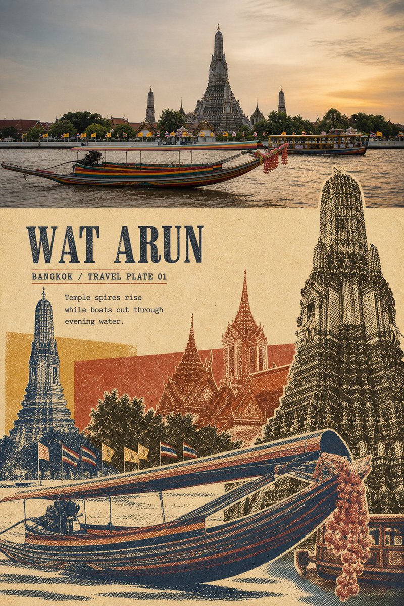
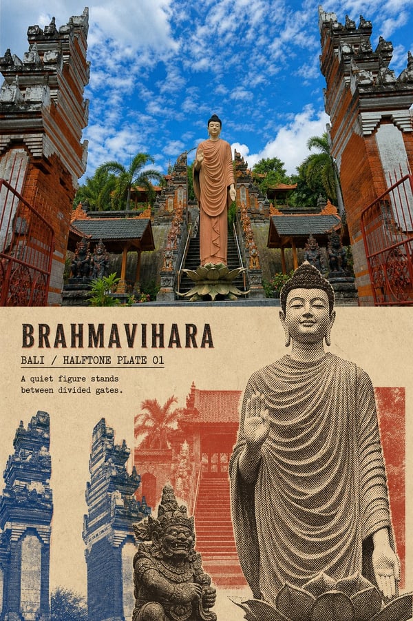
Take each uploaded travel photo and turn it into one independent premium travel-render poster; one photo to one finished poster, never combining multiple photos into a 3x3 grid or a collection.
Use a vertical 3:4 editorial poster layout that clearly preserves the contrast between the original photo and the stylized reinterpretation.
The upper ~40-45% faithfully preserves the original photograph: keep subject identity, number, pose, architecture, vehicle direction, terrain relations, viewing angle, real materials, natural lighting, and original color mood, with only light travel-magazine/art-publication grading and an ultra-thin film grain. The top must remain a clearly recognizable real photo - do not illustration-ify, redesign subjects, or replace the location.
The lower ~55-60% rebuilds the same photo as a "vintage travel mask montage". This is not adding a halftone filter over the whole photo, nor redrawing the same composition. First analyze the photo, lock onto one core subject that best represents the place or event, then extract 4-7 auxiliary elements with clearly distinct silhouettes.
Extractable elements include:
- main landmark or building spire
- secondary rooftops, towers, windows/doors, or sculptures
- boats, vehicles, bicycles, or other transport
- people, animals, or local objects
- trees, flags, umbrellas, signs, or market goods
- directional structures like roads, water, railings, or horizon lines
All elements must come from the same original photo - do not add Buddhist statues, lanterns, elephants, people, buildings, or any regional symbols unrelated to the original scene.
Render each extracted object as an independent photographic mask layer, using silhouette cutouts, coarse-grained black-and-white halftone, partial cut-outs, monochrome ink plates, screen-print color plates, ink loss, paper fiber, trimmed rough edges, and slight misregistration.
Rescale, crop, and rearrange these objects with different sizes, layering, and occlusion:
- The largest subject occupies ~55-95% of the montage height and may be boldly cropped by the frame edge
- A second subject uses a clearly different scale, passing in front of or behind the main element
- Small vehicles, rooftops, plants, flags, or objects act as rhythmic connectors
- At least 5-8 recognizable photo elements
- Do not arrange elements evenly like a moodboard, card, or regular grid
- Do not preserve the original full perspective and scale relationships
Add 1-2 semi-transparent or opaque rectangular/irregular color plates passing behind part of the objects, overlapping and trapping with the halftone layer. The plates separate space and build hierarchy; they must not simply cover the whole background.
The palette is extracted entirely from the original photo and compressed to 3-5 vintage print inks: warm cream or old ivory paper color, the deepest shadow color, plus 2-3 location colors most representative of the original scene. May use black-brown, deep indigo, brick red, ochre yellow, gray-green, faded pink, or colors that genuinely exist in the photo. Overprints may create mixed hues, but avoid rainbow effects, high-saturation clashes, and fixed orange-blue templates.
The lower area may be dense and impactful but must keep ~15-25% of continuous old-paper or solid color field. The whitespace should contrast clearly with the dense objects and give text a stable position.
Derive from the photo's location, subject, and mood:
1. A readable main title of 1-3 English words
2. A short print field such as "EDITION 01" or "TRAVEL STUDY"
3. A 5-10-word observation sentence describing only the genuinely visible scenery, actions, colors, or spatial relations in the photo
Place the text in the continuous old-paper field, solid color plate, or quieter gaps between objects - not spread evenly into the four corners. Use narrow old serifs, compressed sans-serif caps, or bold lead type; text shares the same ink language as the image, with slight ink loss, paper tooth, halftone, and misregistration. The main title must remain clearly readable at chat-preview size.
Overall the piece should combine old travel publications, vintage cultural posters, coarse halftone photo montage, and contemporary editorial design. Dense but clear hierarchy, gritty but not cheap, with distinct place recognition and collectible feel.
Strictly avoid: full-photo filters, redrawing the same composition, single-landmark print, extracting only two or three elements, uniform sizing, regular grids, 3x3 grids, individually framed objects, scrapbook tape, modern smooth vectors, transparent watercolor, cartoon illustration, 3D collage, cultural-symbol templates, cross-location landmark mixing, full-background color coverage, no continuous whitespace, unreadable tiny text, fake Chinese, garbled text, author names, signatures, logos, URLs, QR codes, and watermarks.
Most important rule: extract multiple real objects from the same travel photo, render each as a different-color, different-size mask halftone layer, then rebuild a dense but orderly travel montage through enlargement, cropping, overlapping, overprinting, and interleaved color plates.