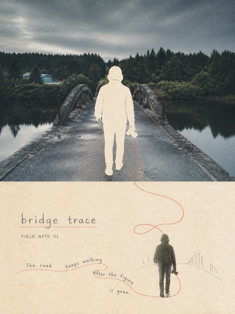
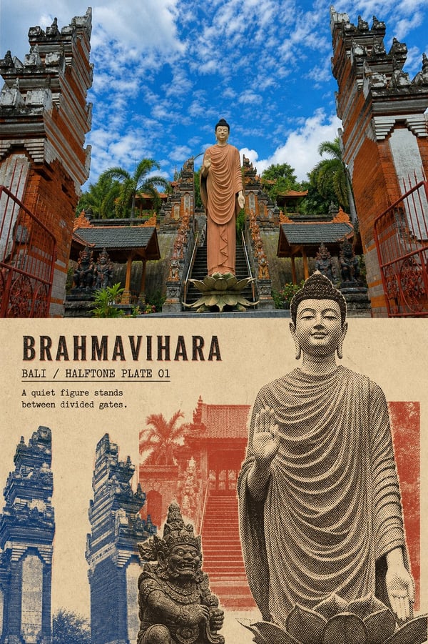
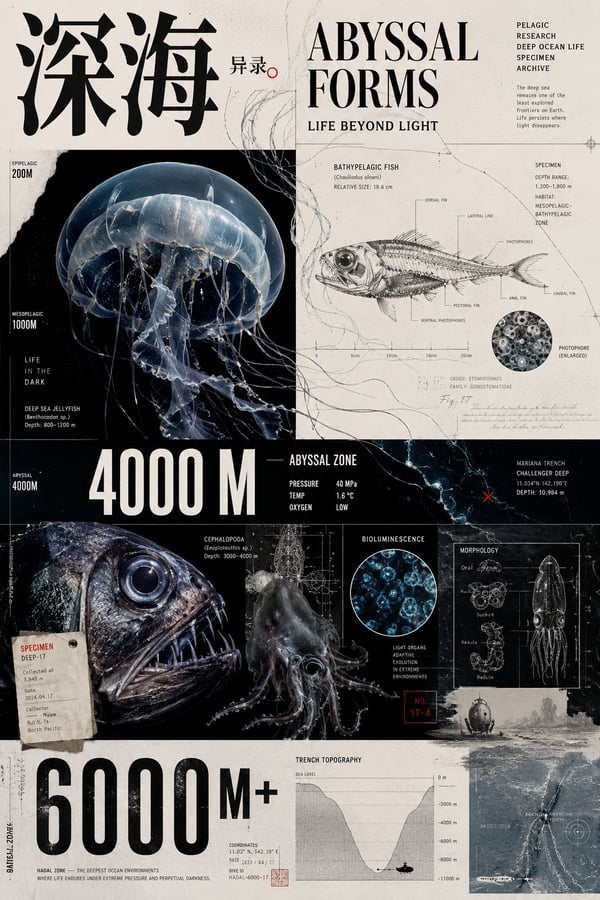
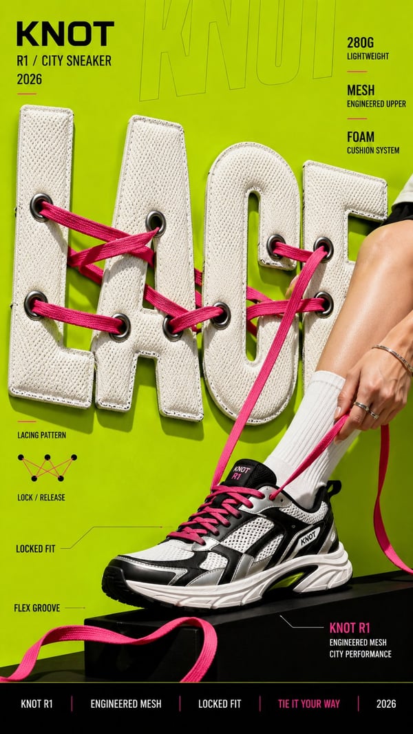
Please turn each uploaded travel photo into an independent "Threadline Travel Memory" editorial poster, each photo output separately, no multi-image compositing. This style suits photos with 1-3 fully outlined figures with clear poses and directional actions such as walking, holding hands, holding an umbrella, supporting each other, gliding, embracing, or climbing. The photo should ideally contain roads, railings, shadows, waterfronts, ropes, tracks, or movement traces that can develop into a continuous threadline running through the frame. Overall use a 3:4 vertical two-layer structure, not the ordinary photo-on-top/illustration-below comparison, but a "upper figures hollowed out, lower figures added back" negative-space memory structure.
Upper layer occupies about 58%-66% of the frame. Faithfully preserve the original photo's environmental photography — architecture, roads, mountains, water, sky, light and shadow, perspective, weather, place-specific color and spatial relationships — with only slight greying, powdery matting, and old art-publication grading. Replace the people in the photo with warm paper-white negative silhouettes, keeping their original count, position, scale, pose, action direction, body overlap and contact relationships intact. The figure negatives must accurately cover exactly where the original figures were, without moving, enlarging, or changing their poses. Edges are clean but with slight paper-fiber feel; use only a very small amount of graphite inner lines to hint at hair, hands, clothing boundaries, backpacks, umbrellas, cameras, or action contact points. The upper figures must not retain photographic color inside, nor should they simply have a white outline added. The viewer should feel that the people have left the real scene, leaving only an accurate paper-white vacancy.
Lower layer occupies about 34%-42% of the frame. Use warm cream thick-grain paper as a continuous background; re-add the same group of figures from the upper layer at a smaller scale as solid echoes in deep charcoal grey, faded ink-black, or graphite, with exactly the same poses, count, action relationships, and core objects. The lower figures usually occupy 20%-42% of the lower-region width and 25%-55% of its height, clearly smaller than the upper negatives. Depending on the original photo's action direction, place them slightly left, right, or center-bottom, echoing the upper figures vertically, diagonally, or along the motion direction. Keep at least 55% continuous paper white in the lower layer. Only allow one to three very faint graphite lines hinting at roads, slopes, railings, waterfronts, or environmental directions; do not redraw a complete background.
Choose one meaningful action or environmental clue from the photo, for example: where the figures hold hands, the umbrella handle, the camera strap, walking steps, the mountain path curve, the bridge vanishing lines, the railing direction, the gliding track, the waterfront or the figures' shadows. Develop it into one continuous hand-drawn line in ochre red, dark red, grey-blue, or rust red. The main line must have a real pencil, wax-thread, or stitching-like materiality: slight trembling, varying thickness, pauses, loops, and broken pressure. It should start from the real action contact point of the upper figures, extend along the photo's environmental direction, cross the horizontal divider, then connect to or wrap around the corresponding hand, foot, or core object of the lower figures. The threadline must not stop abruptly at the divider, nor become a smooth digital path or meaningless decoration.
Keep colors restrained. The upper layer keeps the photo's main place colors but lowers noise and saturation; the figure negatives use warm paper white. The lower layer is dominated by warm white, charcoal grey, and faded ink black, extracting one or two low-saturation environmental colors from the photo as very faint auxiliary trails, plus one dark-red or grey-blue main line connecting upper and lower. According to the photo's real place, action, and mood add: a main title of 1-3 English words; a short field such as "FIELD NOTE 01"; an observation sentence of 5-12 English words. The observation sentence must be determined word-for-word in advance in the prompt, and split into 2-4 segments distributed along the road, the figures' action direction, or the main line's curve across both layers. At least one segment should stay close to, twine around, or continue from the cross-region main line. Typography: thin, slightly hesitant handwriting, lead-pencil lowercase, or wax-thread-like writing. Text may rotate slightly along curves but must remain clearly readable. The main title should sit in the lower continuous whitespace and remain recognizable at chat-preview size.
Avoid: ordinary photo-on-top illustration-below, upper figures still filled with photography, adding only a white outline, figure negatives off their original position, different poses between upper and lower figures, changed figure count, oversized lower figures, fully redrawn environment below, threadline stopping at the divider, smooth vector paths, fashion-figure silhouettes, colorful cartoons, dense decoration, regular digital text boxes, artist names, signatures, logos, URLs, QR codes, watermarks, and fake text. Most important rule: above, you see the accurate paper-white vacancy left after the people departed; below, you see the same action reduced and settled back onto the paper. A hand-crafted line with words along it must join those two identical poses into the same travel memory.