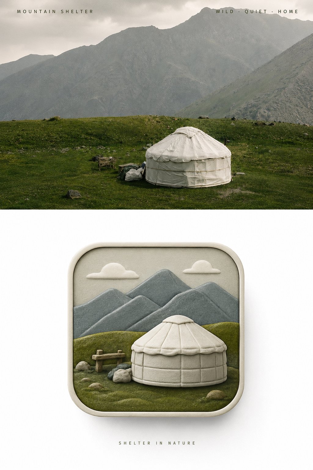
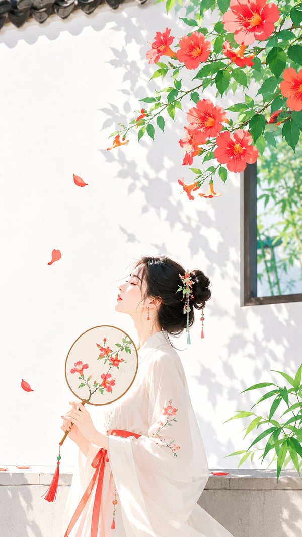
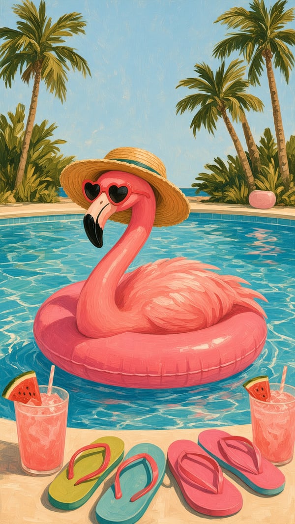
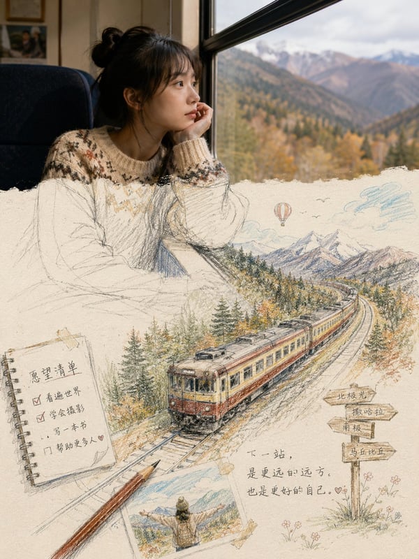
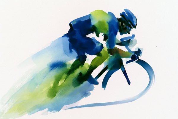
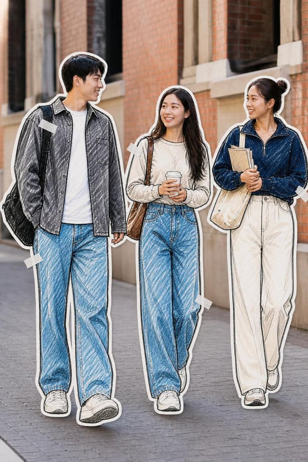
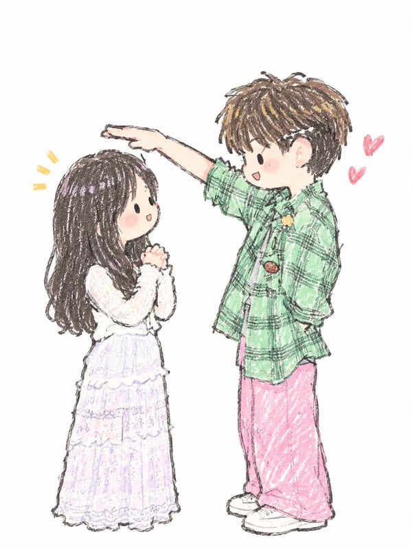
Please turn each uploaded photo into an independent premium design poster — do not collage multiple images, output each photo separately. Overall 3:4 vertical composition, with a strict 1:1 split between two regions, each occupying 50% of the canvas.
The upper half preserves the original photo, keeping the subject's identity, structure, pose, real texture, natural light/shadow and the original color atmosphere, only doing light premium color grading to give it the quality of an art magazine, independent publication or exhibition image. To fit the aspect ratio, the environment can be naturally extended, but the subject must not be stretched, distorted or altered.
The lower half extracts the most recognizable subject, outline, structure, pose and narrative relationship from the photo, first understands the true emotion, action, relationship or visual metaphor worth preserving from the original, and reorganizes it into a pseudo-3D rounded-square icon visual with an original concept. Do not just shrink the photo into the icon, but rebuild the 'soul' of the original image with the fewest but most critical elements: at first glance recognize the subject, at second glance read the relationship, at third glance feel the original mood.
The icon's outer outline must always remain a standard 1:1 square rounded rectangle, equal sides, uniform corners, straight-on view, stable proportion, like a complete high-end App Icon. No stretching, flattening, tilting, perspective distortion, trapezoid shape, or letting the subject break the icon's outer outline. The rounded square is only a fixed visual stage, all creativity, space and narrative happen inside this boundary.
The interior of the icon uses a straight-on pseudo-3D / 2.5D spatial language. The subject is the absolute visual core, with only a small amount of environmental relationships that reinforce the narrative retained around it, forming rich dimensionality through real front-back occlusion, volume thickness, varying depth, soft faceting, local relief and spatial distance. Multiple elements can have different depths, but should feel like they naturally grow out of one continuous space, not like layers of paper stacked together. Avoid isometric sandboxes, top-down models, paper-stacking and complex realistic perspective.
The composition prioritizes the most powerful core visual relationship of the original image, and can strengthen the metaphor via proportion exaggeration, local enlargement, front-back interweaving, formal echo, spatial compression or symbolic transformation, but all changes must serve one clear theme. Maintain a clear visual focus, distinct subject silhouette and good negative space, so the icon still has strong recognizability and unique memory point when scaled down, rather than an ordinary 'object-centered' template icon.
The color scheme is fully derived from the upper original photo, with no preset fixed color menu. First identify the dominant color that best represents the subject's identity and mood, the most vibrant accent color, and the auxiliary color that carries the spatial balance, then re-modulate while preserving the original hue memory: moderately increase brightness, raise purity, remove gray and dirty impurities, sort the warm/cool relationship, separate primary and secondary levels, and strengthen the most spirited color. The final color can be more vivid, translucent and alive than the original photo, but it should still feel naturally derived from the source, not a different palette template. Avoid gray, old, averaged color sampling, no-focus rainbow, fluorescent and cheap candy feel.
The texture is fine, matte, soft modern pseudo-3D sculptural, sitting between high-end editorial illustration, miniature art model and brand 3D visual. Forms have real volume and soft layers, but are not overly smooth, reflective or CG; avoid paper-cut feel, plastic toy feel, glass jelly feel, metallic highlight and game UI texture.
The lower half's surrounding area keeps large clean negative space, showing only this one complete rounded-square icon. If text intervenes, use only a very small amount of refined editorial text placed outside the icon, establishing a quiet, restrained relationship with the overall layout, not adding peripheral decoration or visual noise.
The overall pursuit is fixed rounded-square stage + original-image soul distillation + straight-on pseudo-3D layers + re-art-directed original colors + strong recognizability and original metaphor. The result should look like a piece that could really enter a brand visual proposal or icon creative review, not a photo thumbnail, paper-cut illustration, isometric model or templated App Icon.