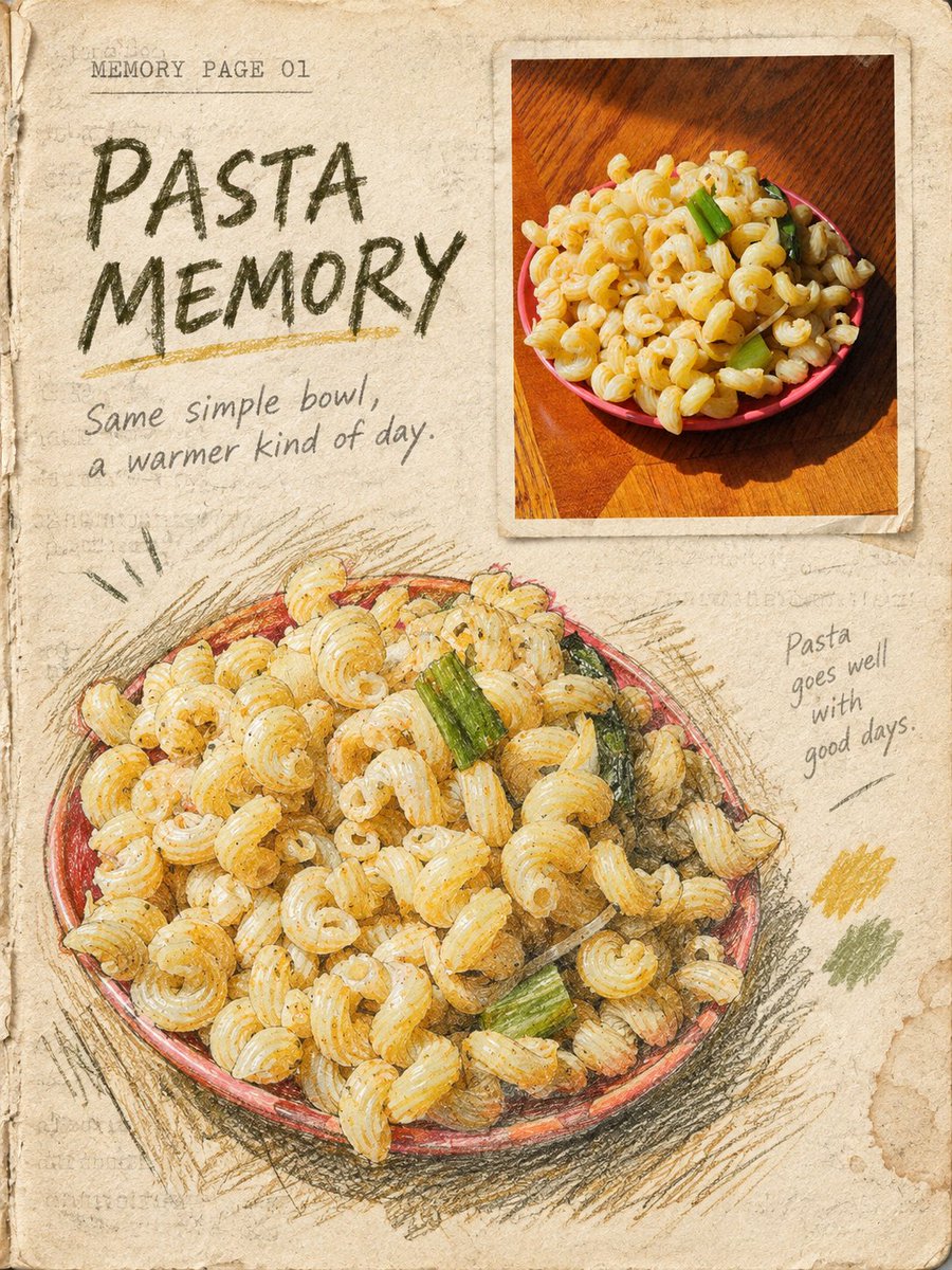
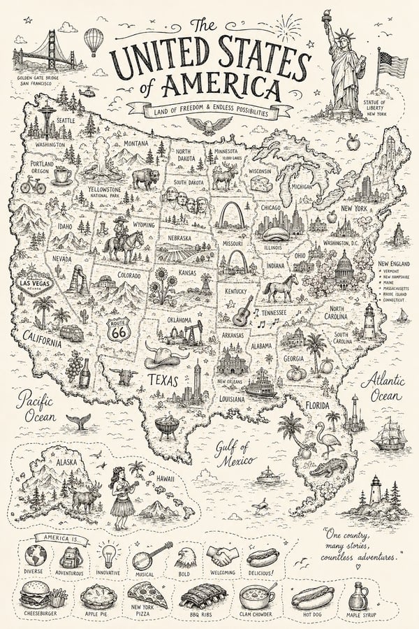
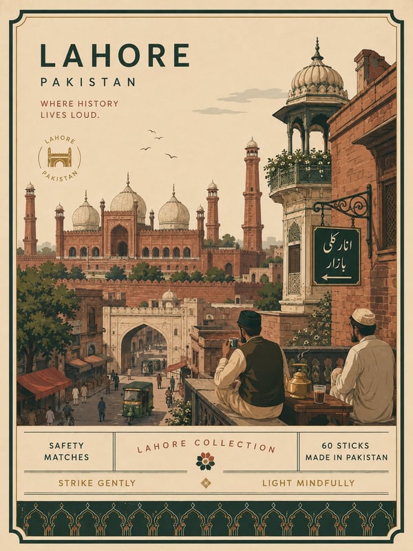
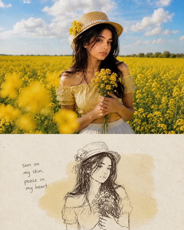
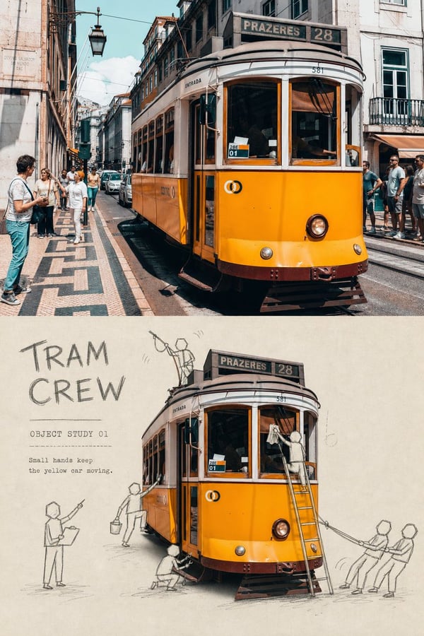
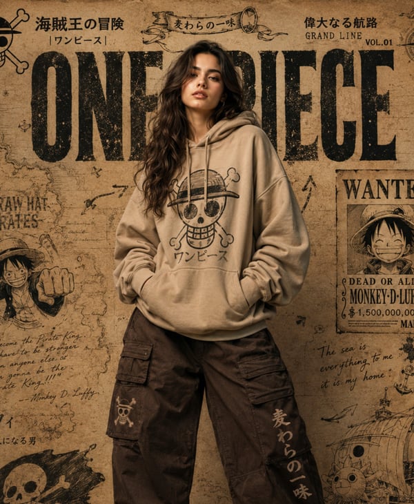
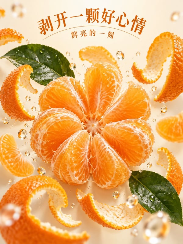
The photo looks like a matte photographic print pasted into a book page; the line art looks repeatedly drawn on toothy paper with crayons, pencils and dry ink; the light color washes settle into the paper grain. The image thus no longer relies on two colors, but builds tactility through fibers, embossing, ink absorption, erasure marks and brush strokes.
Create a vertical 3:4 travel-editorial book page in the style of "TACTILE PAPER FOOD MEMORY|触感纸页美食记忆". This is not an above-below comparison, nor a two-color poster. The whole canvas is one warm off-white old book page with paper-pulp fibers, tooth and slight embossing; the background has extremely faint, unreadable old printed text texture, page-edge scuffs and uneven paper color. Place the input photo as a small neat matte photo window at the upper-right or mid-right, occupying about 18% to 34% of the frame. The photo edges look like a matte print pasted into the page, with thin paper borders, ink-absorbing edges and contact shadows. In the lower-left or lower-middle area, draw an enlarged hand-drawn echo of the same photo, occupying about 30% to 45%. The drawing is built from deep olive crayon, graphite pencil, dry steel-nib ink lines and a little low-saturation pastel — real pen-pressure variation, crayon grain, broken dry-ink strokes, cross-hatching, erasure marks, paper white showing through, and pigment particles caught in the paper grain must be visible. The lines must not be smooth, must not become auto-tracing, and must not be a flat olive-green two-tone. The photo window and the drawing are offset in placement with no horizontal divider between them. Keep 45% to 60% of the canvas as continuous warm-white book-page negative space. Add at most two low-saturation tints extracted from the photo. Forbidden: clean vector line art, digital filters, smooth gradients, full-page watercolor, above-below photo diptych, torn-paper collage, glossy screens, fictional food, fake Chinese, logos, watermarks, AI corner marks and original-image corner marks.
照片像被贴进书页的哑光相纸,线稿像用蜡笔、铅笔和干墨在有齿面的纸上反复描画,淡彩则沉积在纸纹里。这样画面不再依赖双色,而是通过纤维、压痕、吸墨、擦痕和笔触制造触感。
制作一张竖向3:4旅行编辑书页,风格为"TACTILE PAPER FOOD MEMORY|触感纸页美食记忆"。这不是上下对比,也不是双色海报。整张画布是一页有纸浆纤维、齿面和轻微压痕的暖白旧书页;背景有极淡、不可读的旧印刷文字肌理、页边擦痕和不均匀纸色。将输入照片作为右上或右中的小型规整哑光照片窗,约占画面18%至34%。照片边缘像一张被贴入页面的哑光相纸,带细薄纸边、吸墨边缘和接触阴影。在左下或偏下位置绘制同一照片的放大手绘回声,约占画面30%至45%。手稿由深橄榄色蜡笔、石墨铅笔、干燥钢笔墨线和少量低饱和粉彩叠出,必须看见真实笔压变化、蜡笔颗粒、干墨断裂、交叉排线、擦拭痕、纸面露白和颜料颗粒卡在纸纹中的沉积。线条不要光滑,不要成为自动描边,也不要只是平面的橄榄绿双色。照片窗与手稿错位分布,中间不加水平分隔线。全画面保留45%至60%的连续暖白书页留白。最多加入两种从照片提取的低饱和淡彩。禁止干净矢量线稿、数字滤镜、光滑渐变、整页水彩、照片上下双联、撕纸拼贴、亮面屏幕、虚构食物、假中文、Logo、水印、AI角标和原图角标。